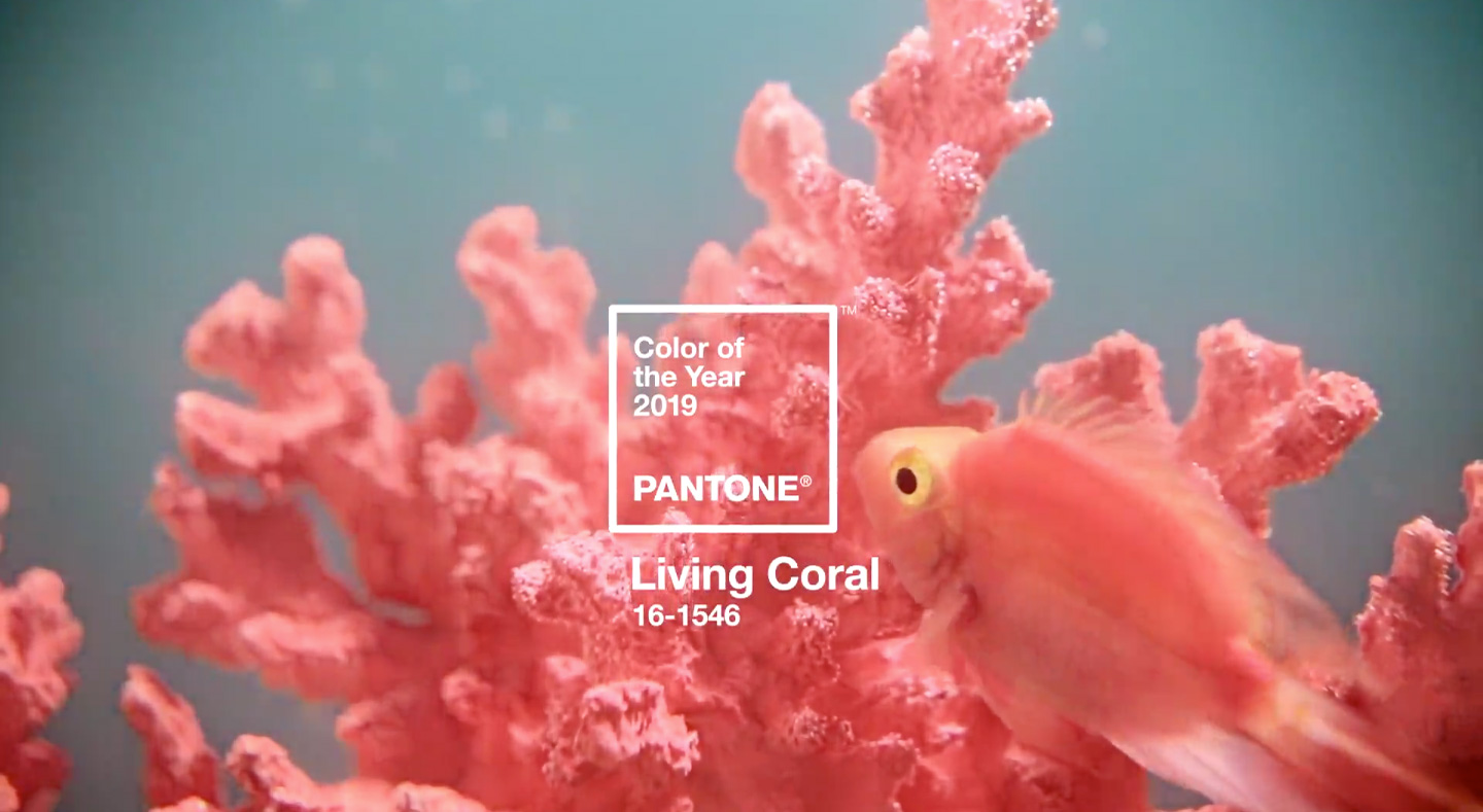
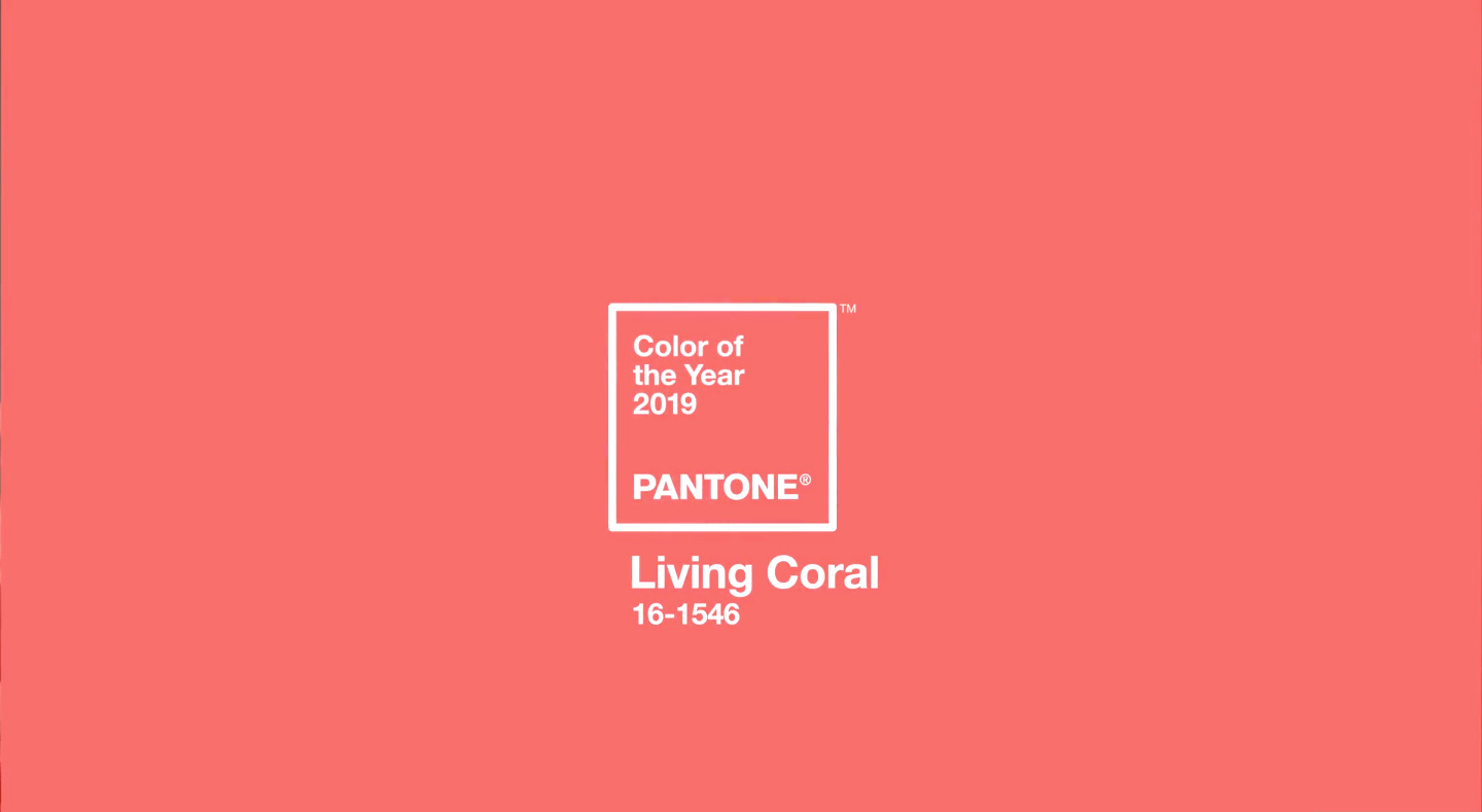
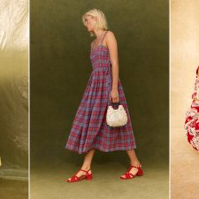
Introducing the Pantone Color of the Year 2019, PANTONE 16-1546 Living Coral – an animating and life-affirming coral hue with a golden undertone that energizes and enlivens with a softer edge
Vibrant, yet mellow PANTONE 16-1546 Living Coral embraces us with warmth and nourishment to provide comfort and buoyancy in our continually shifting environment.
In reaction to the onslaught of digital technology and social media increasingly embedding into daily life, we are seeking authentic and immersive experiences that enable connection and intimacy.
Sociable and spirited, the engaging nature of PANTONE 16-1546 Living Coral welcomes and encourages lighthearted activity. Symbolizing our innate need for optimism and joyful pursuits, PANTONE 16-1546 Living Coral embodies our desire for playful expression. Representing the fusion of modern life, PANTONE Living Coral is a nurturing color that appears in our natural surroundings and at the same time, displays a lively presence within social media.
Color is an equalizing lens through which we experience our natural and digital realities and this is particularly true for Living Coral. With consumers craving human interaction and social connection, the humanizing and heartening qualities displayed by the convivial Pantone Living Coral hit a responsive chord.
– Leatrice Eiseman, Executive Director of the Pantone Color Institute
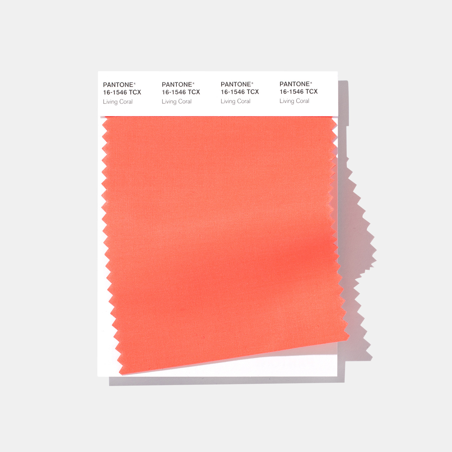
PANTONE 16-1546 Living Coral in Cotton SMART Color Swatch Cards
Pantone’s Color Swatch Cards are Pantone’s leading cotton color standard for designers and product developers in apparel, textiles, and soft home. Made on double layered fabric to the most exacting color specifications, the Pantone swatch card includes a bar code through which you can purchase the full spectral data separately for assured color accuracy in production. All other Fashion, Home, and Interiors cotton products are references to this definitive color standard.
PANTONE 16-1546 Living Coral emits the desired, familiar, and energizing aspects of color found in nature. In its glorious, yet unfortunately more elusive, display beneath the sea, this vivifying and effervescent color mesmerizes the eye and mind. Lying at the center of our naturally vivid and chromatic ecosystem, PANTONE Living Coral is evocative of how coral reefs provide shelter to a diverse kaleidoscope of color.
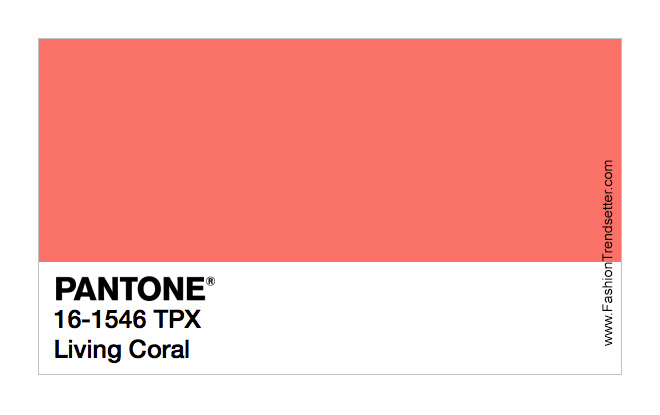
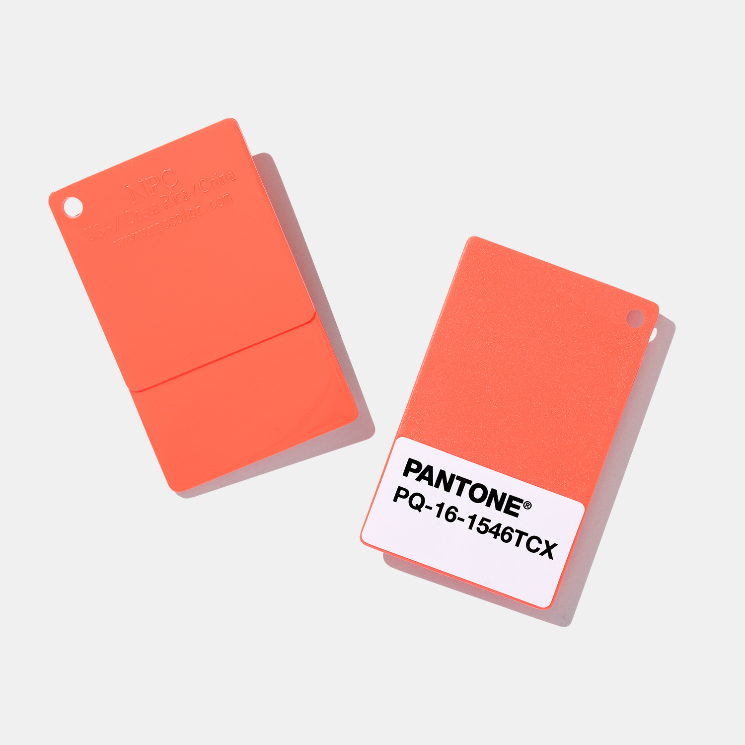
PANTONE 16-1546 Living Coral in Pantone Plastic Standard Chips
Pantone Plastic Chips are the most comprehensive tool for palette development, communication, and production of plastic products. Our system can be matched to our Graphics or Fashion, Home + Interiors colors, enabling consistent replication across your materials. Each chip includes matte and gloss finishing, tiered thicknesses, and pigment formulations for maximum color accuracy and reproduction… MORE INFO: fashiontrendsetter.com/~pantone-plastic-standard-chips-collection/
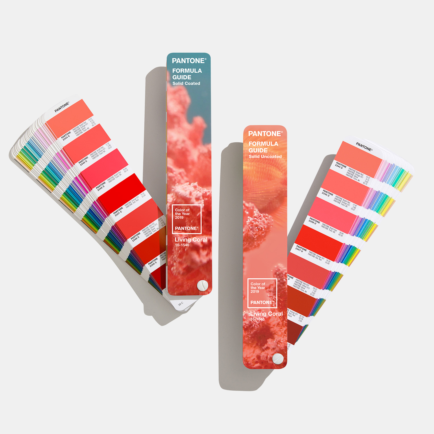
Formula Guide, Limited Edition Pantone Color of the Year 2019 Living Coral
Pantone’s best-selling guide in the world for design inspiration, color specification, and printing accuracy – now available in a limited edition to celebrate the Pantone Color of the Year 2019. PANTONE 16-1546 Living Coral is an animating and life-affirming coral hue with a golden undertone that energizes and enlivens with a softer edge. This special edition coated and uncoated set features a beautiful soft-touch cover. Inside, you’ll find a full page of Living Coral, more about why Pantone has selected the color for 2019, and a complete history of the past Colors of the Year.
About the PANTONE Color of the Year
The Color of the Year selection process requires thoughtful consideration and trend analysis. To arrive at the selection each year, Pantone’s color experts at the Pantone Color Institute comb the world looking for new color influences. This can include the entertainment industry and films in production, traveling art collections and new artists, fashion, all areas of design, popular travel destinations, as well as new lifestyles, playstyles and socio-economic conditions. Influences may also stem from new technologies, materials, textures and effects that impact color, relevant social media platforms and even up-coming sporting events that capture worldwide attention. For 19 years, Pantone’s Color of the Year has influenced product development and purchasing decisions in multiple industries, including fashion, home furnishings and industrial design, as well as product packaging and graphic design. Past selections for Color of the Year include:
• PANTONE 18-3838 Ultra Violet (2018)
• PANTONE 15-0343 Greenery (2017)
• PANTONE 15-3919 Serenity and PANTONE 13-1520 Rose Quartz (2016)
• PANTONE 18-1438 Marsala (2015)
• PANTONE 18-3224 Radiant Orchid (2014)
• PANTONE 17-5641 Emerald (2013)
• PANTONE 17-1463 Tangerine Tango (2012)
• PANTONE 18-2120 Honeysuckle (2011)
• PANTONE 15-5519 Turquoise (2010)
• PANTONE 14-0848 Mimosa (2009)
• PANTONE 18-3943 Blue Iris (2008)
• PANTONE 19-1557 Chili Pepper (2007)
• PANTONE 13-1106 Sand Dollar (2006)
• PANTONE 15-5217 Blue Turquoise (2005)
• PANTONE 17-1456 Tigerlily (2004)
• PANTONE 14-4811 Aqua Sky (2003)
• PANTONE 19-1664 True Red (2002)
• PANTONE 17-2031 Fuchsia Rose (2001)
• PANTONE 15-4020 Cerulean (2000)
The color selected as our Pantone Color of the Year 2019 was taken from the PANTONE Fashion, Home + Interiors Color System, the most widely used and recognized color standards system for fashion, textile, home and interior design.
For more information on the PANTONE Color of the Year for 2019, please visit Pantone.com/~color-of-the-year-2019
About Pantone and the Pantone Color Institute
PANTONE®, a wholly owned subsidiary of X-Rite, Incorporated, is the global color authority and provider of professional color standards for the design industries. Today Pantone’s universal language of color is used by 100 million design professionals worldwide to access color trends, communicate color choices and control consistency of color across every imaginable surface, texture, material and finish.
Through the Pantone Color Institute, Pantone continues to chart future color direction and study how color influences human thought processes, emotions and physical reactions. Pantone furthers its commitment to providing professionals with a greater understanding of color and to help them utilize color more effectively. Always a source for color inspiration, Pantone also offers designer-inspired products and services for consumers. More information is available at www.pantone.com. For the latest news, trends, information and conversations, connect with Pantone on Instagram, Facebook, Twitter, and Pinterest.
All images and trend information courtesy of PANTONE®.
Tags: Color, color codes, Color of the Year, color trends, coral, COY, design, fashion, fashion design, home, interior, Living Coral, Pantone, PANTONE 16-1546 TPX Living Coral, Pantone Color Institute, Pantone Color of the Year, Pantone Polyester Standards, Pantone Polyester Swatch Set, style, Top, trends
