FASHION TRENDSETTER ARCHIVES | PLEASE CLICK LOGO FOR THE NEW WEBSITE! |
|||
  |   |   |   |   |   |
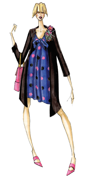
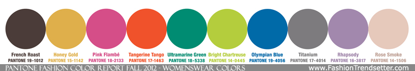
From love potions and the magical hour of sunset to witches and warlocks, fantasy and illusion are inspiring designers this fall season. With an unexpected mix of darks, brights and neutrals, they cleverly manipulate reality to transport consumers to an enchanting place, free from the stresses of everyday life. As the season transitions from the heat of summer, Bright Chartreuse, a vital yellow-green, pays homage to a typical spring shade and creates a bridge into the cooling days of fall. Reminiscent of bright green foliage, it provides a perfect accent to every color in the palette.
|
|
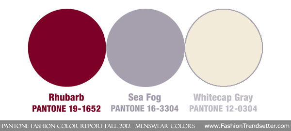
Like the name implies, Pink Flambé is a delicious, vibrant pink with a bit of heat to it. Pair it with vivacious and enticing Tangerine Tango [more info] for an ongoing retro feeling. Or, to bring a calming element to the mix, combine these vibrant warm tones with Ultramarine Green, a deep, cooling blue-green. Ethereal Rhapsody is a grayed-down purple that also encourages comfort and serenity with its quiet, muted tone. Honey Gold, a mellow, burnished yellow, suggests the soft-muted tones of sunlight to brighten a fall day. Pair it with sensible and strong Olympian Blue, a patriotic blue that will surely make its way into fall and winter athletic apparel. Rich and robust, French Roast is a tasty, sophisticated hue that is a great alternative to the black and charcoal basics typically worn in the fall. Other staple neutrals include elegant and versatile Titanium, the quintessential cool gray, and Rose Smoke, a veiled rose tone that pairs well with Rhapsody and Titanium. Similar to this season's palette for women, there is something for everyone in the top color selections for men. Rhubarb, a deep, pungent hue, brings intensity to the palette, and is best paired with Tangerine Tango and Honey Gold for a collegiate look. To hit the ski slopes in style, combine Ultramarine Green with Bright Chartreuse and Olympian Blue for the ultimate in winter athletic apparel. Moving from the vibrant tones of fall to more neutral basics, Whitecap Gray is a classic off-white, reminiscent of an overturning wave under a winter sky. Sea Fog, a gray with a muted purple cast, exudes just the right amount of confidence and masculinity. Pair these two neutrals with the strength of Titanium for a subtle and sophisticated direction. Combine all three neutrals in a dress shirt or tie with basic, versatile French Roast for a classic fall look. PantonePantone LLC, a wholly owned subsidiary of X-Rite, Incorporated, has been the world's color authority for almost 50 years, providing design professionals with products and services for the colorful exploration and expression of creativity. Always a source for color inspiration, Pantone also offers designer-inspired products and services for consumers.The colors featured in the PANTONE Fashion Color Report are culled from the PANTONE FASHION + HOME Color System, the most widely used and recognized color standards system in the world. Each season, Pantone surveys the designers of New York Fashion Week and beyond to collect feedback on prominent collection colors, color inspiration and color philosophy. This information is used to create the PANTONE Fashion Color Report, which serves as a reference tool throughout the year for fashion enthusiasts, reporters and retailers. More information is available at www.pantone.com.
|
|
||||||||||||||||||||||||||||