The top 10 fall '09 colors for women are: |
 |
American Beauty
PANTONE 19-1759
C/M/Y/K
19 / 100 / 72 / 8
GOE 26-2-7C |
 |
Purple Heart
PANTONE 18-3520
C/M/Y/K
64 / 72 / 0 / 0
GOE 51-3-4C |
 |
Honey Yellow
PANTONE 16-1143
C/M/Y/K
15 / 36 / 75 / 0
GOE 143-1-3C |
 |
Iron
PANTONE 18-1306
C/M/Y/K
50 / 51 / 52 / 29
GOE 158-1-4C |
 |
Burnt Sienna
PANTONE 17-1544
C/M/Y/K
16 / 70 / 63 / 0
GOE 23-5-2C |
 |
Nomad
PANTONE 16-1212
C/M/Y/K
26 / 28 / 45 / 2
GOE 145-2-1C |
 |
Rapture Rose
PANTONE 17-1929
C/M/Y/K
10 / 66 / 29 / 0
GOE 23-3-3C |
 |
Warm Olive
PANTONE 15-0646
C/M/Y/K
24 / 12 / 98 / 0
GOE 1-2-5C |
 |
Majolica Blue
PANTONE 19-4125
C/M/Y/K
91 / 59 / 32 / 50
GOE 82-4-3C |
 |
Crème Brûlée
PANTONE 13-1006
C/M/Y/K
9 / 11 / 23 / 0
GOE 144-1-1C |
|
"Designers recognize the desire for fundamental basics that speak to current economic conditions, but also understand the need to incorporate vibrant color to grab the consumers' eyes and entice them to buy."
In addition to designer contributions, this season's report features insights from industry thought leaders including Tim Gunn, chief creative officer at Liz Claiborne Inc. and mentor on Bravo's "Project Runway," Nina Garcia, fashion director at Marie Claire and judge on Bravo's "Project Runway," as well as Clinton Kelly, co-host of TLC's "What Not to Wear." These fashion insiders offer consumers tips on how to stay fashionable on a budget.
According to the report, subtle contrasts make up the diverse palette for fall 2009. This season, designers play with a broad spectrum of color resulting in distinct, yet cohesive combinations. Like a painter's palette, fall 2009 offers choice and diversity, but the unexpected integration of colors is what makes it so appealing.
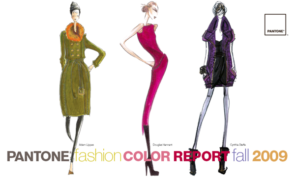
A natural choice during uncertain times, patriotic American Beauty, a wonderfully balanced, true red, speaks to the need for cohesiveness. Perfect for all skin tones, American Beauty is a feel-good color. Purple Heart connotes a sense of refinement and sensuality, adding an air of creativity and excitement to the top 10, especially when paired with American Beauty.
A warmer, more subdued Honey Yellow carries the 2009 color of the year, PANTONE 14-0848 Mimosa, through to fall and winter with its golden tones. Pairing Honey Yellow with its color wheel opposite, Purple Heart, will surely add a surprising flair. Or, for a more typical fall combination, group Honey Yellow with Burnt Sienna and Iron.
Strong yet understated Iron serves as the "new black," making traditional basics much more interesting. Neither gray nor brown, Iron is a grounding color that coordinates well with all colors in the palette. Crème Brûlée, a grayed-down beige, and Nomad, which bridges the gap between beige and light gray, also speak to the need for timeless neutrals. All three classics can stand alone or serve as anchors when paired with other colors.
Fall would not be complete without a seasonal favorite like Burnt Sienna, a deepened, earthy shade of orange, reminiscent of an autumn sunset. Pair this versatile hue with Nomad and Rapture Rose for a different twist. Adding spark to the fall palette, Rapture Rose artfully captures the vibrancy of fuchsia and the softness of pink. Underscored by nurturing and feminine tones, Rapture Rose enlivens the more traditionally subdued fall hues. Look for it in cosmetics as well as clothing and accessories.
Like the olive in a martini, Warm Olive, a rich yellow-green, adds a touch of elegance and sophistication to fall. When combined, this tangy, intriguing hue makes all other colors come alive. Look for it paired with Majolica Blue, a deep, mysterious teal blue with more vibrancy than the usual navy. Majolica Blue brings an exotic flair to the group, especially when paired with Burnt Sienna or Purple Heart.
The colors featured in the PANTONE Fashion Color Report are culled from the PANTONE FASHION + HOME Color System, the most widely used and recognized color standard in the world. Each season, Pantone surveys the designers of New York Fashion Week to collect feedback on prominent collection colors, color inspiration and color philosophy. This information is used to create the PANTONE Fashion Color Report and serves as a reference tool throughout the year for fashion enthusiasts, reporters and retailers.
For more information about the Pantone Fashion Color Report Fall 2009 please visit:
www.pantone.com/fall2009
For more information about the Pantone Goe System please read:
www.fashiontrendsetter.com/~Pantone-Goe-System.html |