|
Pantone Fashion Color Report Summer 2015 #color #fashion #trends #NYFW #Pantone #FashionTrendsetter
Pantone Fashion Color Report Summer 2015 |
En Plein Air; Designers Move Toward the Cooler and Softer Side of the Color Spectrum This Season |
|
|
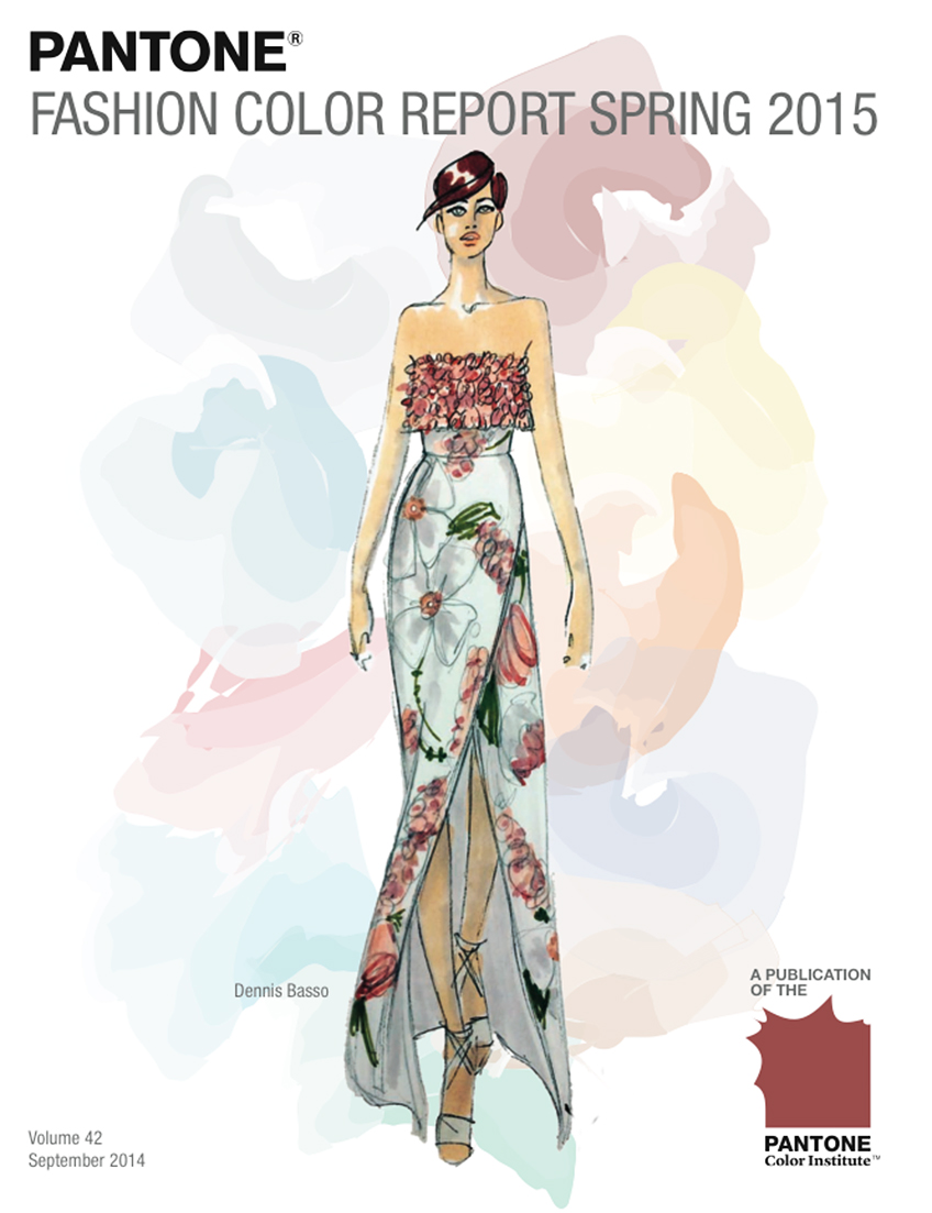 |
| Fashion Design Sketch by Dennis BASSO, Courtesy of PANTONE. |
[Carlstadt, N.J.], September 5, 2014 - Pantone LLC, an X-Rite company and the global authority on color and provider of professional color standards for the design industries, announced PANTONE® Fashion Color Report Summer 2015, a comprehensive overview of designers' use of color in their upcoming collections.
"Many feel compelled to be connected around the clock because we are afraid we'll miss something important. There is a growing movement to step out and create 'quiet zones' to disconnect from technology and unwind, giving ourselves time to stop and be still," said Leatrice Eiseman, executive director of the Pantone Color Institute.
"Color choices follow the same minimalistic, 'en plein air' theme, taking a cue from nature rather than being reinvented or mechanically manipulated. Soft, cool hues blend with subtle warm tones to create a soothing escape from the everyday hustle and bustle."
|
|
|
Pantone Fashion Color Report Summer 2015 | Color Codes |
 |
 |
 |
 |
 |
 |
| Aquamarine |
Scuba Blue |
Lucite Green |
Classic Blue |
Toasted Almond |
Strawberry Ice |
 |
 |
 |
 |
 |
 |
| Tangerine |
Custard |
Marsala |
Glacier Gray |
Dusk Blue |
Treetop |
 |
 |
 |
 |
The colors featured in the PANTONE Fashion Color Report are culled from the PANTONE FASHION + HOME Color System, the most widely used and recognized color standards system for fashion, textile, home and interior design. Each season, Pantone surveys the designers of New York Fashion Week and beyond to collect feedback on prominent collection colors, color inspiration and color philosophy. This information is used to create the PANTONE Fashion Color Report, which serves as a reference tool throughout the year for fashion enthusiasts, reporters and retailers.
The report is available at www.pantone.com/spring2015 |
| Woodbine |
Sandstone |
Titanium |
Lavender Herb |
|
|
The Top Colors for Women's Fashion
for Summer 2015 are:
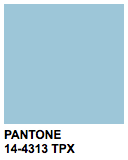
PANTONE 14-4313 Aquamarine
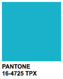
PANTONE 16-4725 Scuba Blue
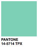
PANTONE 14-5714 Lucite Green
PANTONE 19-4052 Classic Blue
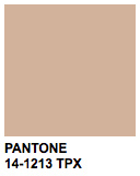
PANTONE 14-1213 Toasted Almond
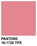
PANTONE 16-1720 Strawberry Ice
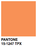
PANTONE 15-1247 Tangerine
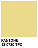
PANTONE 13-0720 Custard
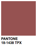
PANTONE 18-1438 Marsala
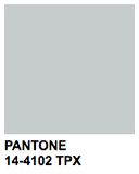
PANTONE 14-4102 Glacier Gray |
The Top Colors for Men's Fashion
for Summer 2015 are:
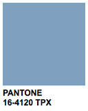
PANTONE 16-4120 Dusk Blue
PANTONE 14-4102 Glacier Gray
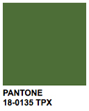
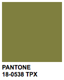
PANTONE 18-0135 Treetop
PANTONE 19-4052 Classic Blue
PANTONE 14-1213 Toasted Almond
PANTONE 18-0538 Woodbine
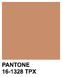
PANTONE 16-1328 Sandstone
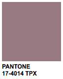
PANTONE 17-4014 Titanium
PANTONE 18-1438 Marsala
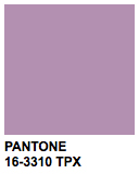
PANTONE 16-3310 Lavender Herb |
|
|
|
|
|
Pantone Summer 2015 Women's Color Palette |
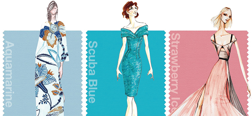 |
| [From Left to Right] Fashion Design Sketches by BANJANAN by Caroline WELLER, Barbara TFANK and Bibhu MOHAPATRA, Courtesy of PANTONE. |
|
On one end of the women's palette sits Aquamarine, an airy, ethereal blue with a cool, dreamy feel that mixes well with the other blues and greens in the Top 10. Evoking thoughts of soothing, tropical waters, Scuba Blue restores our sense of carefree playfulness, while invigorating the body and mind, and Lucite Green, a soft, serene green offers a fresh sense of clarity.
Pair Lucite Green with bold Classic Blue for a balanced and refreshed look. As the name implies, Classic Blue is a strong and reliable anchor and, with its waterborne qualities, is perceived as thoughtful and introspective. Bringing balance to the coolness of the spring/summer color range, Toasted Almond, a suntanned neutral, offers timeless, comforting warmth.
Reminiscent of the sun on our skin in the spring and summer months, Toasted Almond pairs well with both Strawberry Ice, a light, nurturing coral tone, and Tangerine, an energizing, non-jarring take on orange that adds a pop of color for spring. Combine all three for a delicious, almost retro-inspired look. Emanating warmth and happiness, Custard serves as an all-encompassing yellow for the spring palette, which can be combined with Classic Blue for a maritime look. Much like the fortified wine that gives Marsala its name, this compelling and cordial hue incorporates the satisfying richness of a tastefully fulfilling meal, while it's grounding red-brown roots point to a sophisticated, natural earthiness. Marsala works well with Glacier Gray, a timeless and unobtrusive gray that adds a sense of graceful relaxation as another practical neutral. Bring Marsala and Glacier Gray together with Aquamarine for an unexpected and exciting pairing that is perfect for spring. |
|
|
Pantone Summer 2015 Men's Color Palette |
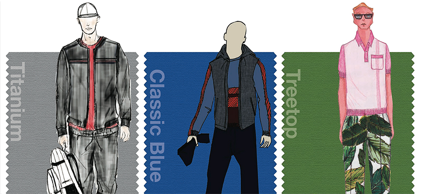 |
| [From Left to Right] Fashion Design Sketches by GENTS, PERRY ELLIS (Submission by Michael MACCARI) and David HART, Courtesy of PANTONE. |
For spring 2015, the men's palette takes a surprising turn, deviating from the women's palette more than we have seen in recent seasons. The menswear colors emphasize the need for uncontrived hues, where natural tones are interspersed with deep, foundational colors for an unassuming and sophisticated Top 10.
A perennial favorite for men, dependable Dusk Blue offers a cool, calm serenity, representative of the sky. Juxtapose it with Glacier Gray, a masculine and practical neutral, or Treetop, nature's healthy, harmonious green for a happy marriage of adaptable cool, warm and neutral tones. Classic Blue remains a core anchoring hue that is powerful in tailored suits or casual sportswear, while Toasted Almond continues to serve as another essential neutral. With its yellow-green tint, Woodbine is a tropical green best described as nature's neutral that pairs well the earthy and rugged associations of Sandstone.
Masculine and solid, Titanium is a gray that speaks to timelessness and exudes strength, while Marsala offers a robust and rich contrast to the other colors in the palette and combines dramatically with other deep tones like Classic Blue, as well as neutral Sandstone. Create a charming melange with Woodbine, Titanium and Lavender Herb, the palette's most fashion-forward and spirited color. As purple hues continue to gain popularity in men's fashion, Lavender Herb's mid-tone offers a retro and almost nostalgic element to the men's palette.
|
About Pantone and the Pantone Color Institute
Pantone LLC, a wholly owned subsidiary of X-Rite, Incorporated, is the global color authority and provider of professional color standards for the design industries. Pantone products have encouraged colorful exploration and expressions of creativity from inspiration to implementation for more than 50 years. Through the Pantone Color Institute, Pantone continues to chart future color direction and study how color influences human thought processes, emotions and physical reactions. Pantone furthers its commitment to providing professionals with a greater understanding of color and to help them utilize color more effectively. Always a source for color inspiration, Pantone also offers designer-inspired products and services for consumers. More information is available at www.pantone.com. For the latest news, trends, information and conversations, connect with Pantone on Facebook, Twitter, Pinterest, Instagram and the Pantone Blog.
PANTONE and other Pantone trademarks are the property of Pantone LLC. © 2014. All rights reserved. |
| Pantone Fashion Color Report Summer 2015 is available at www.pantone.com/spring2015 |
|
 |